TBK
Prime Grill
BRAND IDENTITY • PACKAGING • SIGNAGE
TBK
Prime Grill
BRAND IDENTITY • PACKAGING • SIGNAGE
DESIGN LANGUAGE
An American spirit with an Italian twist
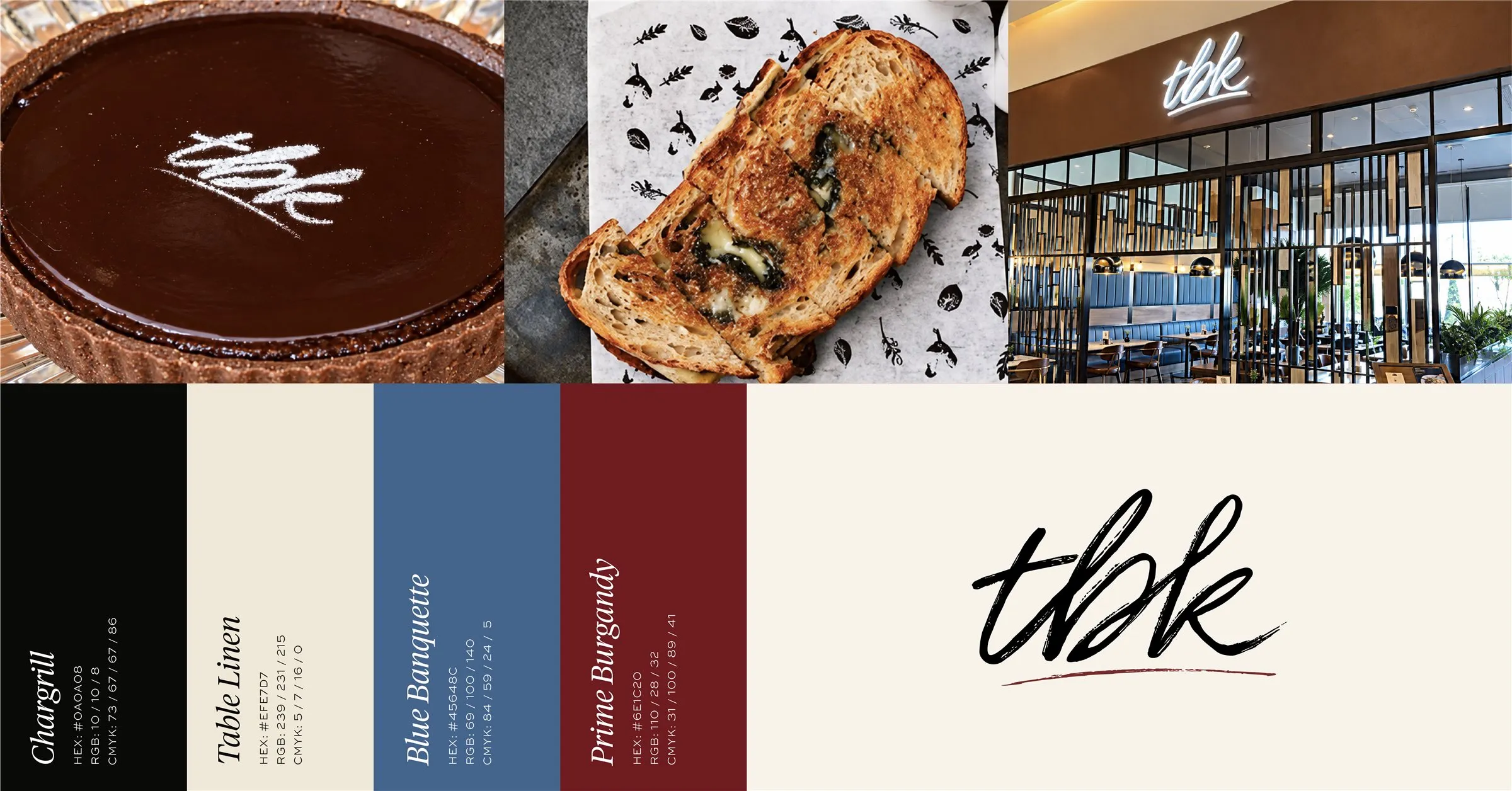
The look and feel for TBK Prime Grill in Dubai was developed alongside the interior designers. The hand-lettered TBK mark brings an informal, confident energy to the American and Italian inspired restaurant. Burgundy, blue, near-black and cream give the identity a bold palette that sits comfortably with the warm interior.
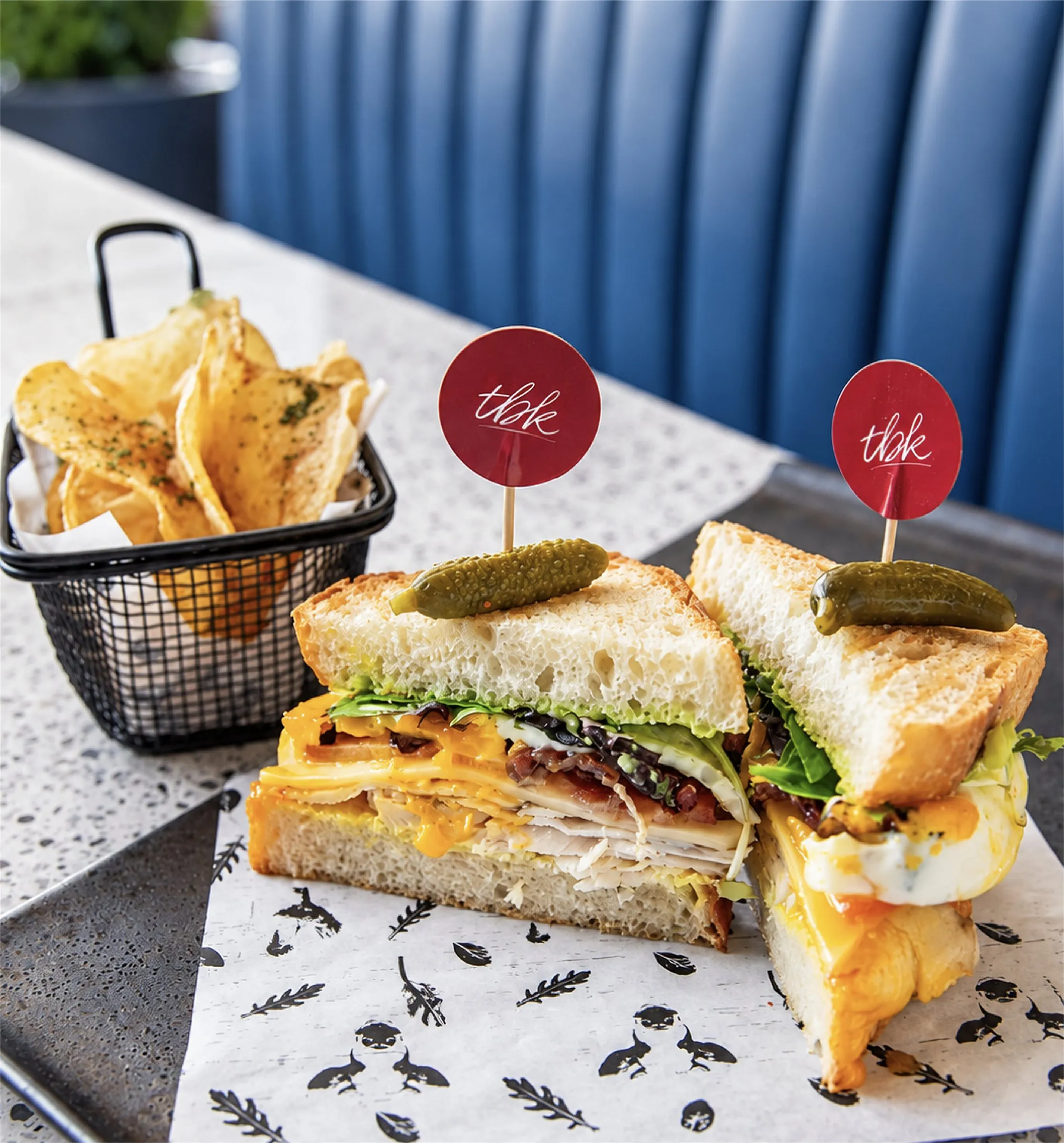
Illustrated details add character to the packaging, reflecting the restaurant's relaxed approach to all-day dining.
CONCEPT
A signature full of character
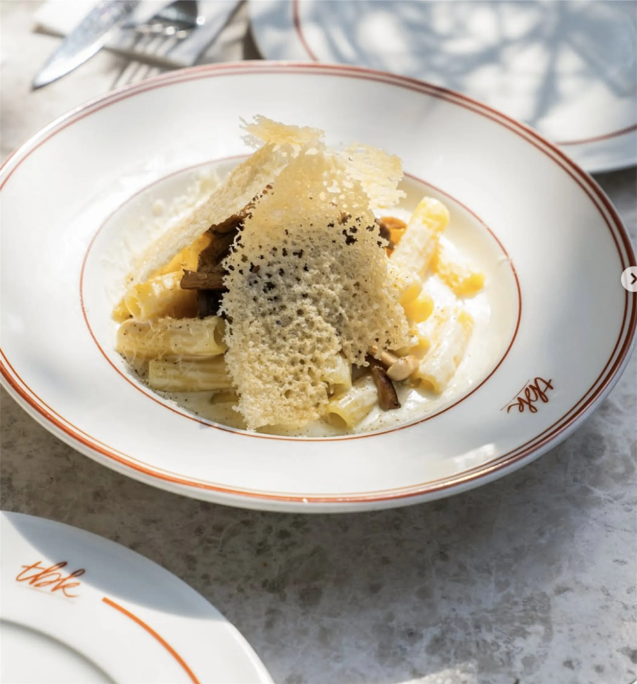
The flowing TBK lettering gives the restaurant a recognisable signature across the storefront, menus and packaging. Its loose strokes feel familiar and full of movement. Custom illustrations bring personality to the takeaway pieces and extend the visual language beyond the dining space.
APPLICATION
Beyond the plate, into the space
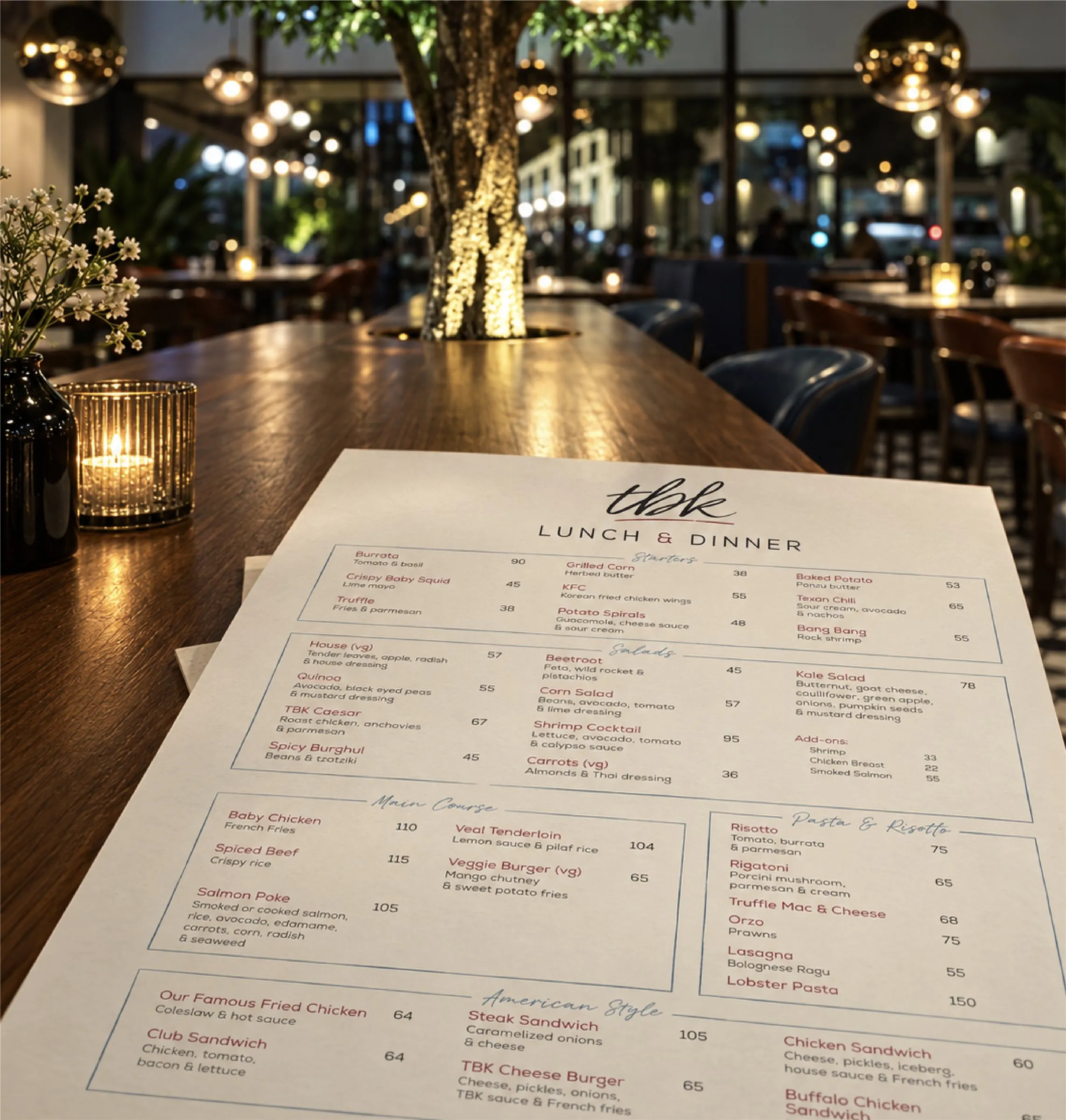
The menus balance expressive lettering with a clear typographic structure, making the American and Italian influenced offering easy to explore. Illustrated packaging carries the same character into takeaway. Bold exterior signage gives TBK a confident presence, with burgundy and blue tying the graphics back to the interior.

_6ae1f7cd77f1d.webp)