Peggy Porschen
Chelsea Parlour
ILLUSTRATION • SIGNAGE DESIGN
Peggy Porschen
Chelsea Parlour
ILLUSTRATION • SIGNAGE DESIGN
DESIGN LANGUAGE
A feminine setting with a golden touch
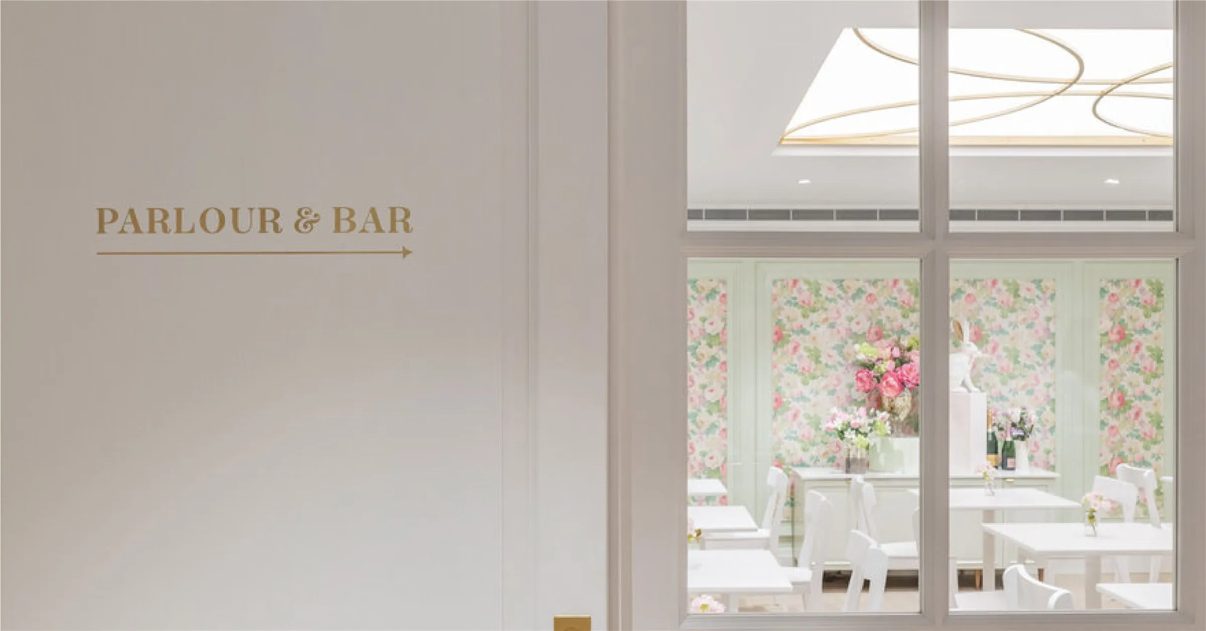
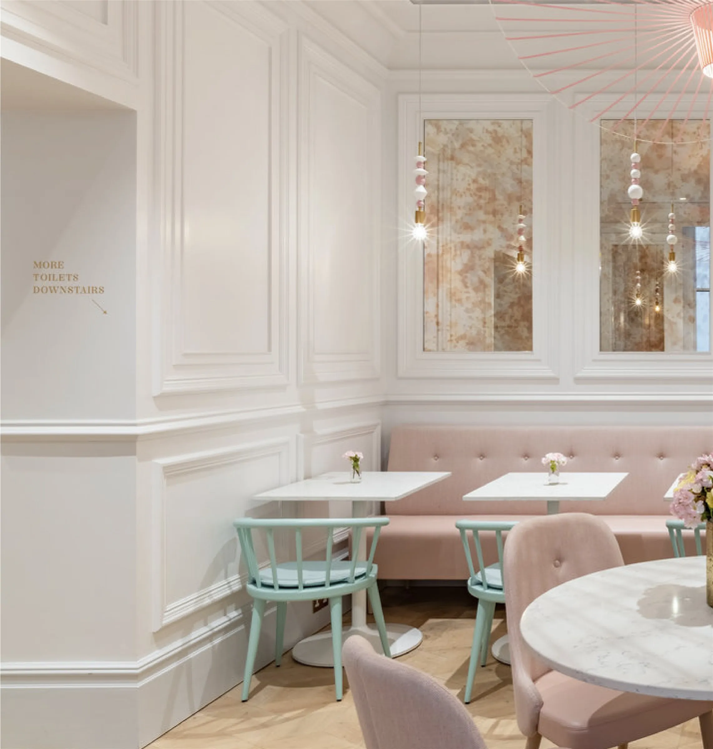
For Peggy Porschen's Chelsea Parlour, I designed illustrated wayfinding and lettering to complement its feminine interior. Fine gold details sit against pastel pink and cream, bringing elegance to the signs that guide visitors through the space.
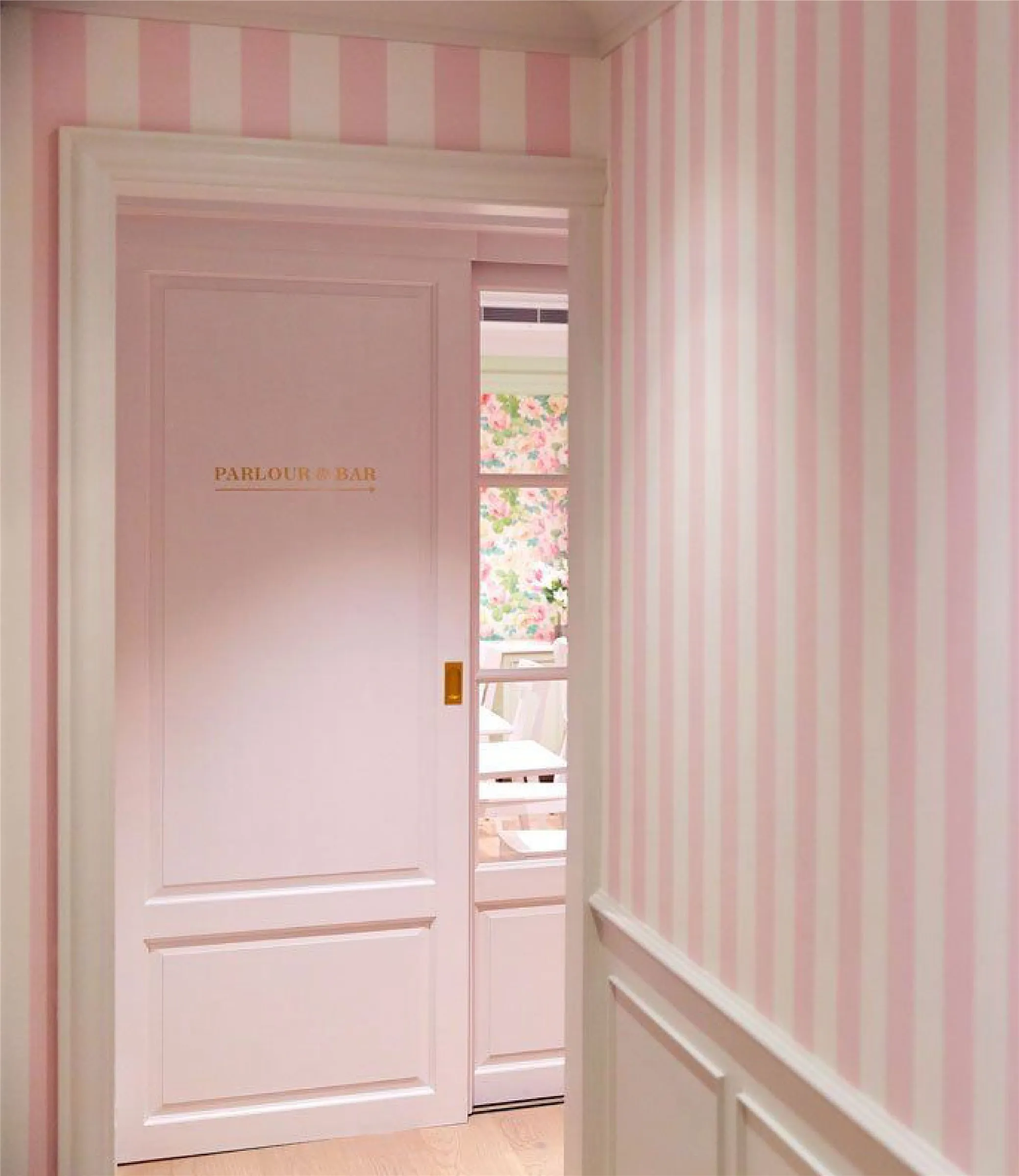
Graceful lettering and small illustrated details add a playful note. The signs reflect the Parlour's decorative character alongside its floral features, striped walls and delicate finishes.
CONCEPT
Delicate lines with a playful spirit
The visual language is built around a restrained typographic system, allowing the work itself to lead. A neutral, architectural palette supports this approach, creating a timeless foundation that feels both contemporary and enduring. Subtle detailing and considered spacing echo the discipline and structure inherent within architectural practice.
APPLICATION
Gold lettering with a graceful finish
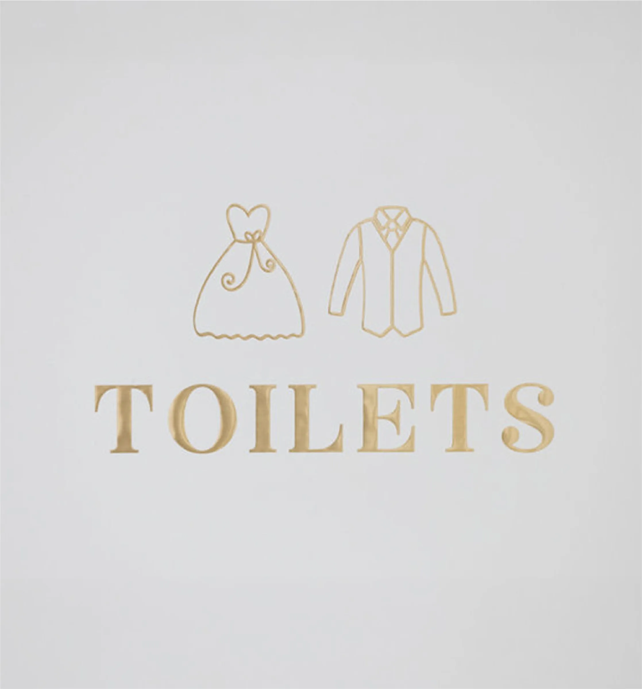
The "Parlour & Bar" direction and illustrated "Toilets" sign carry the visual language across the Chelsea Parlour. Gold lettering catches the light against pale walls and doors, adding a considered embellishment between rooms.

_6ae1f7cd77f1d.webp)