Anthracite
Martini Lounge
MENU DESIGN • COLLATERAL • SIGNAGE
Anthracite
Martini Lounge
MENU DESIGN • COLLATERAL • SIGNAGE
DESIGN LANGUAGE
After-dark elegance with a seductive edge
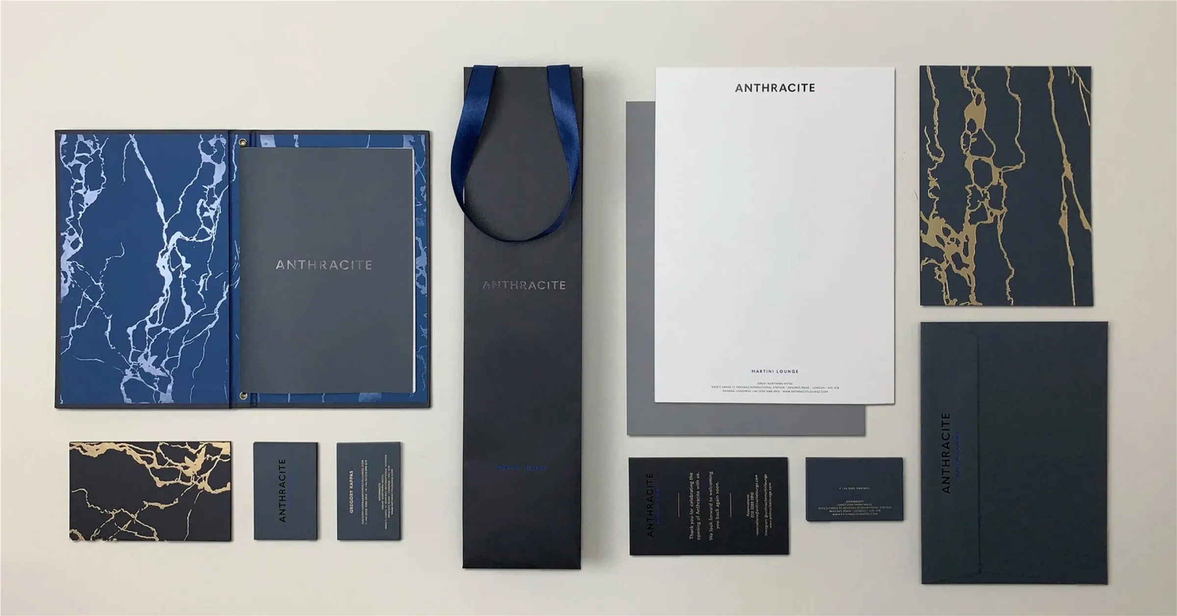
Set within the Great Northern Hotel at King's Cross, Anthracite Martini Lounge needed a look and feel that matched the hotel's elegance while creating a mood of its own. Near-black tones and polished finishes give the space an intimate, after-dark quality, lifted by flashes of vivid blue and restrained gold.
The contrast between matte and gloss, dark and light, creates a sense of quiet drama. Across the menus and printed details, the visual language feels refined but never formal, inviting guests to settle in for a martini and stay a little longer.
CONCEPT
A palette shaped by depth and contrast
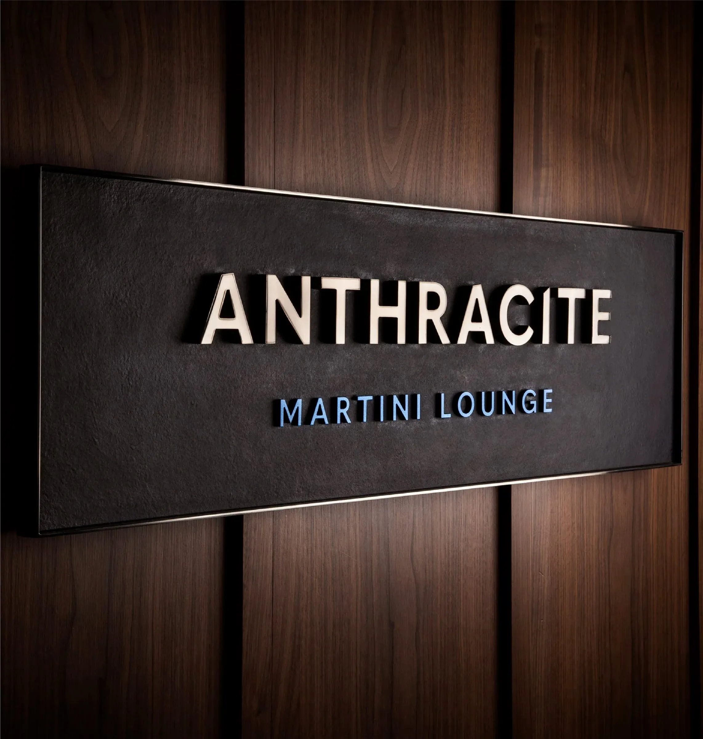
The look and feel draws on anthracite's dark, lustrous character and its connection to the hotel's railway setting. Charcoal, navy and black create depth, punctuated by a vivid blue that recalls heat and energy. Clean, cut details in the lettering add a contemporary note within the historic building.
APPLICATION
A considered finish at every table
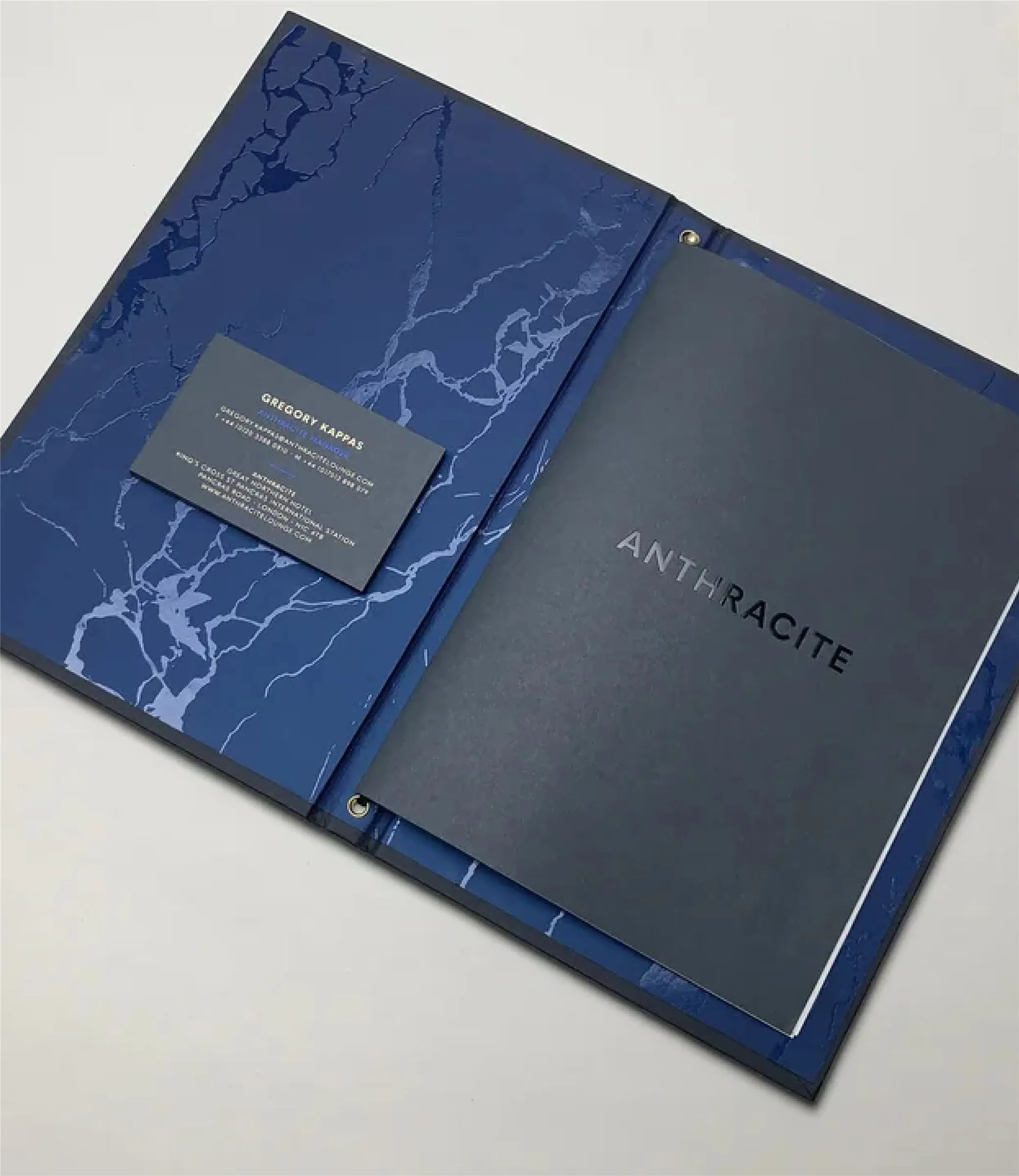
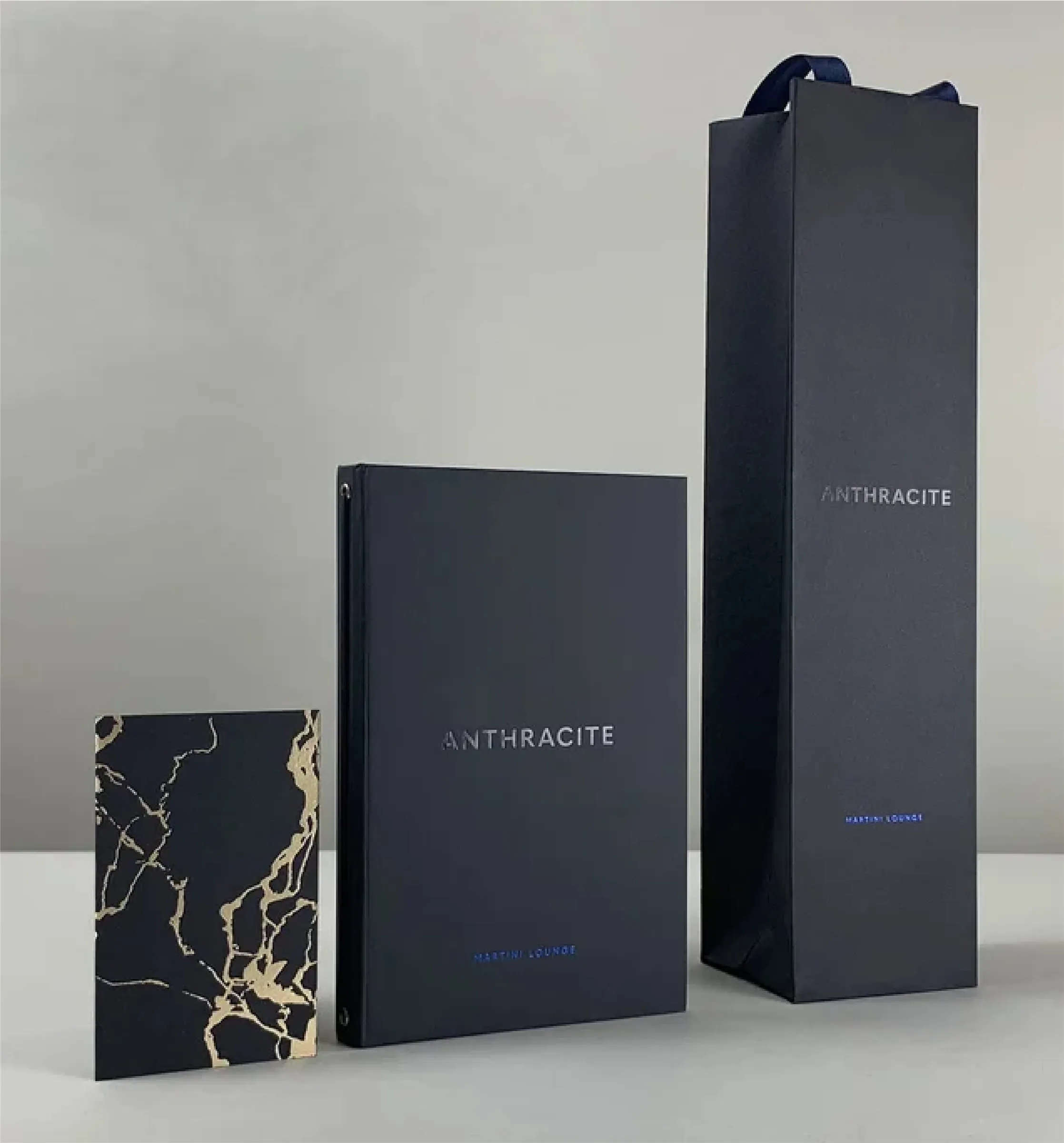
The menus carry the dark palette into the guest experience, pairing clear typography with rich surfaces and selective metallic accents. Printed collateral and signage extend the same atmosphere beyond the bar, while marble and gold notes connect the graphics to the lounge interior.

_6ae1f7cd77f1d.webp)